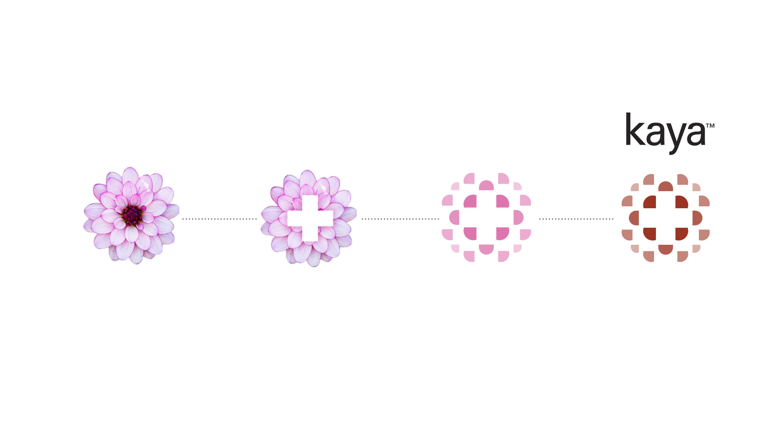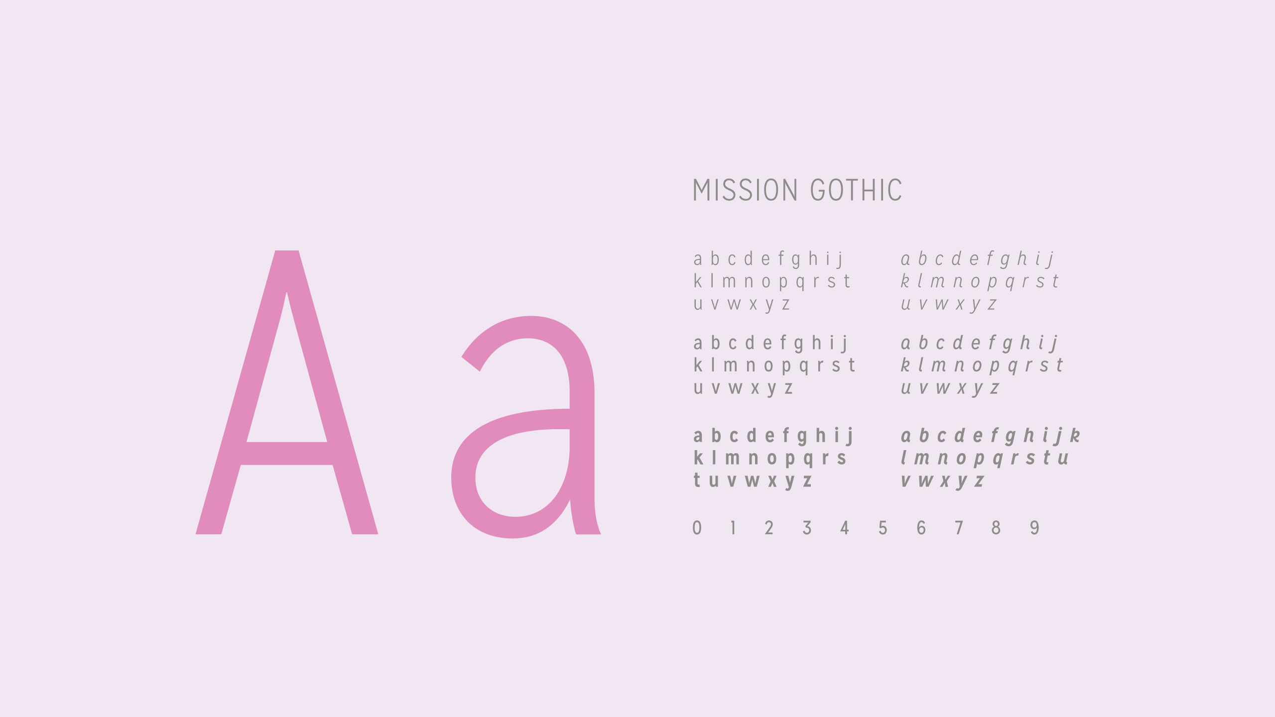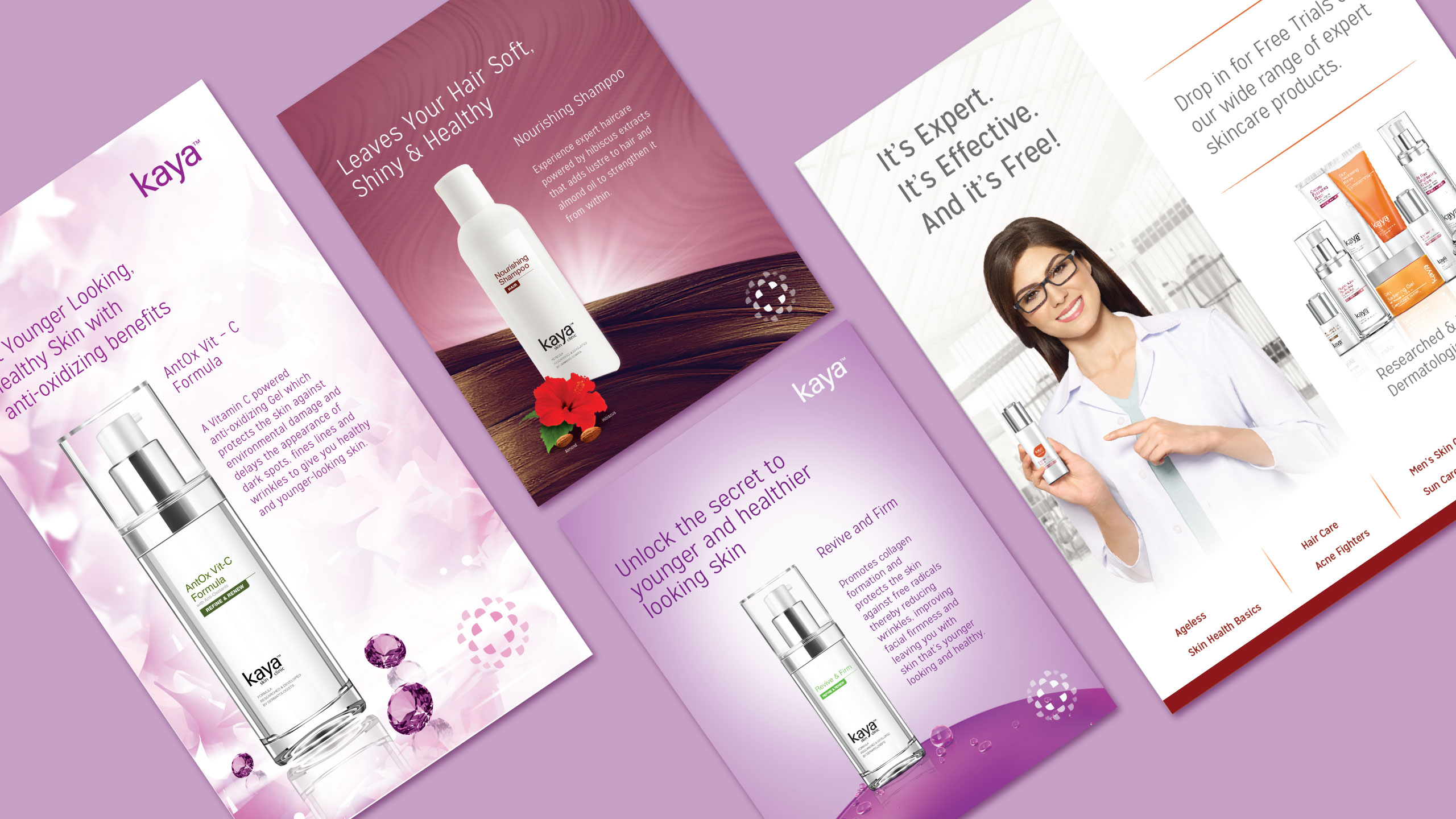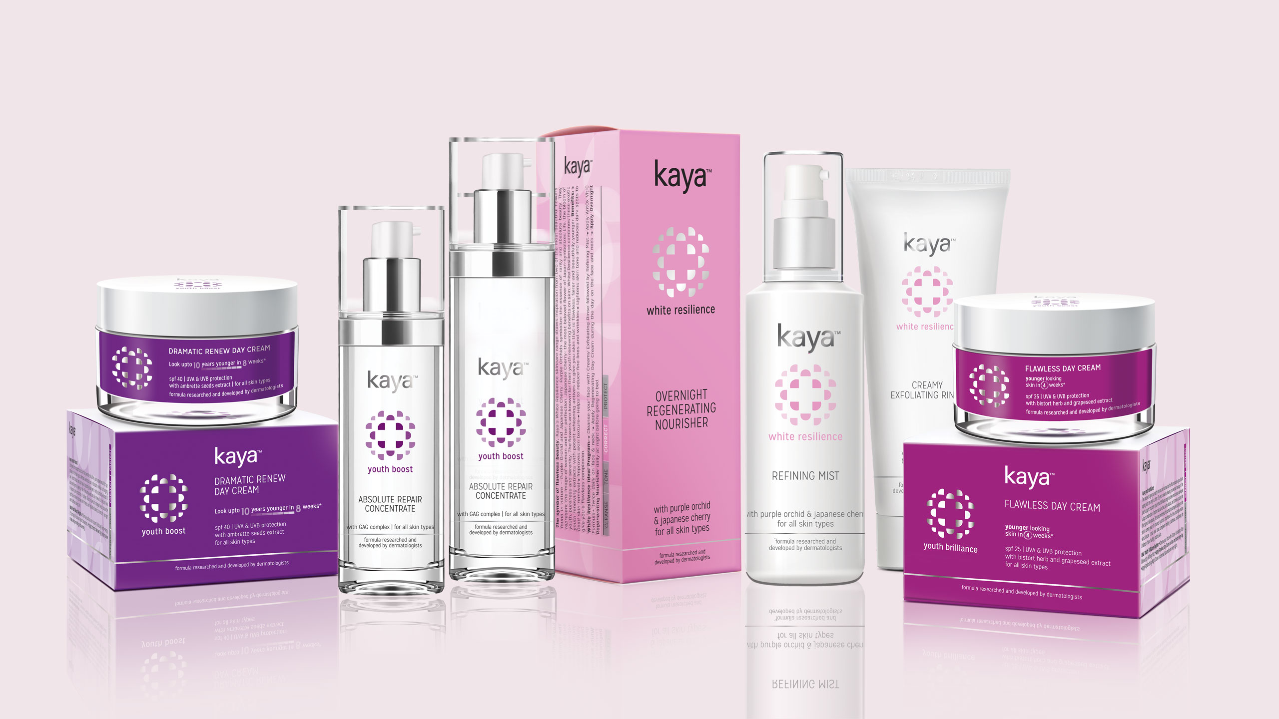
When Kaya decided to move from a dermatological-services driven brand to a product driven brand, it needed a rethink on its brand position and product range. Now that the products were no longer prescribed, they needed to connect with consumers on their own. From a motif that said ‘clinical + beauty’ to the introduction of colour and easier categorization, we helped the brand make this transition from a ‘clinical’ look to a softer and more engaging one, without losing its expertise.
Marico Kaya Enterprises Ltd.
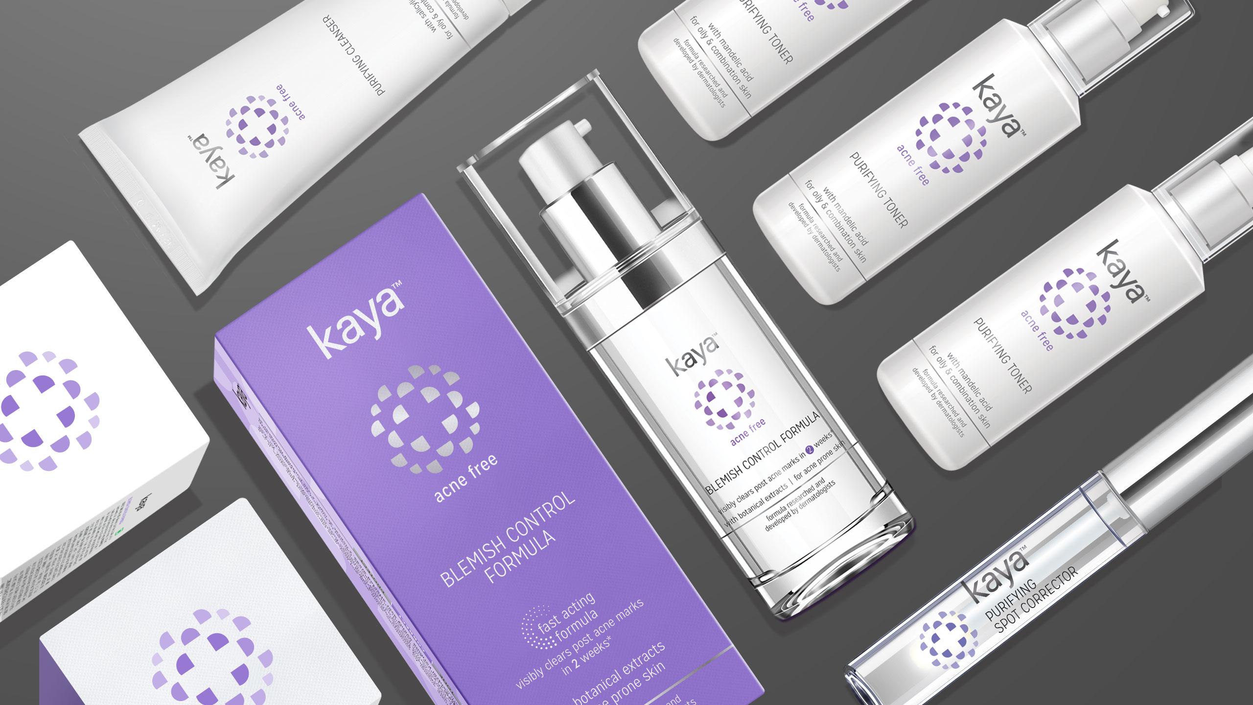
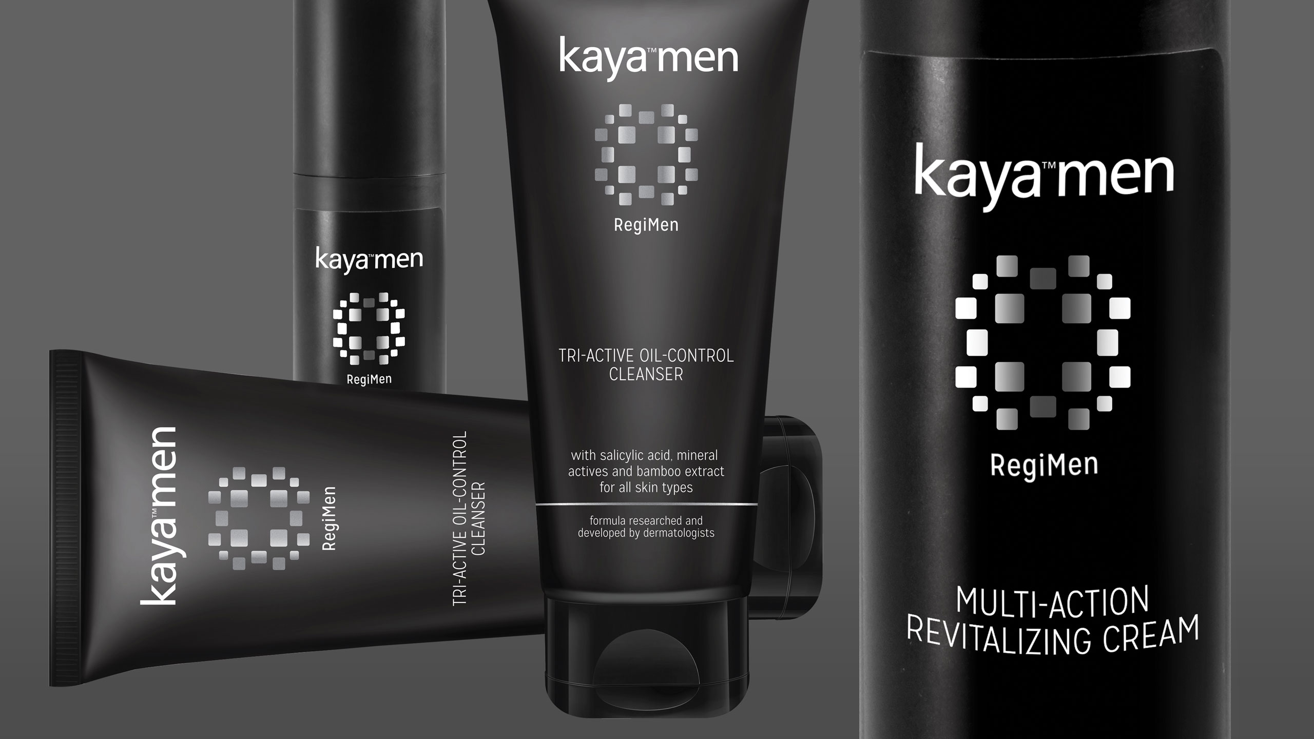
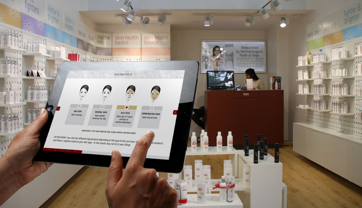
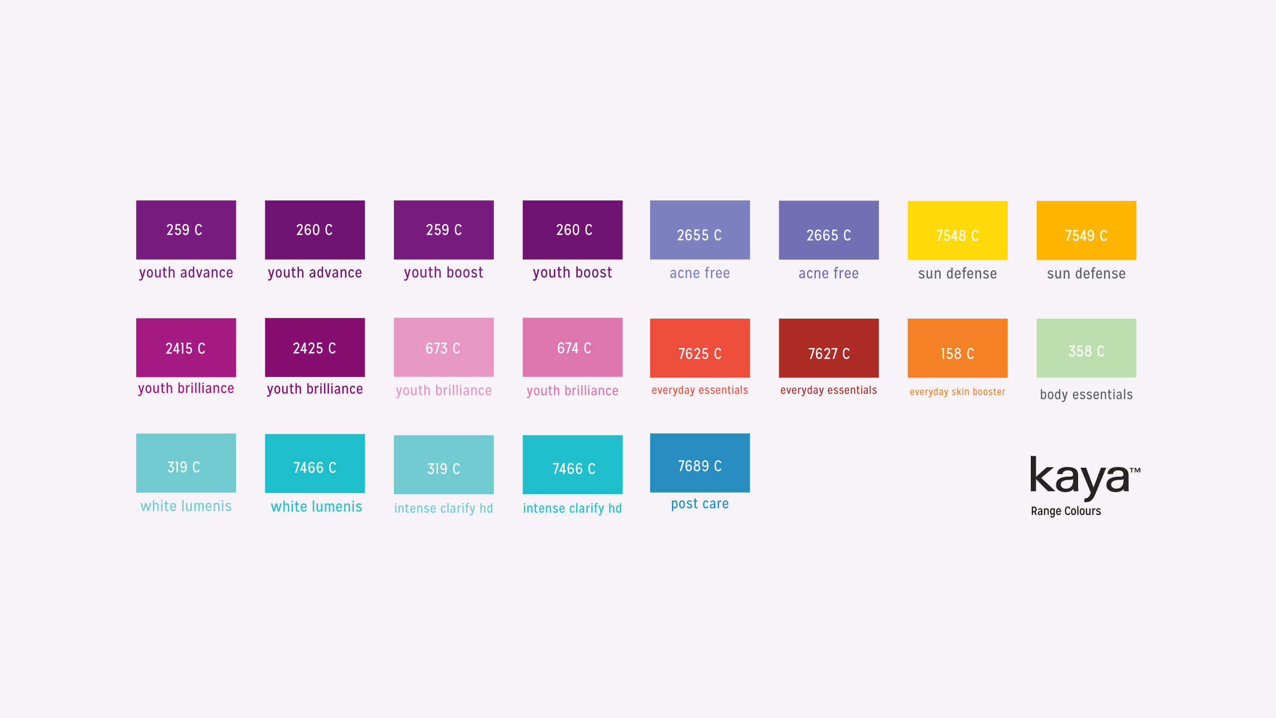
Design Research, Brand Re-positioning, Brand Mark, Product & Range Nomenclature, Range Architecture, App Design, Pack Designs, Key Visuals.