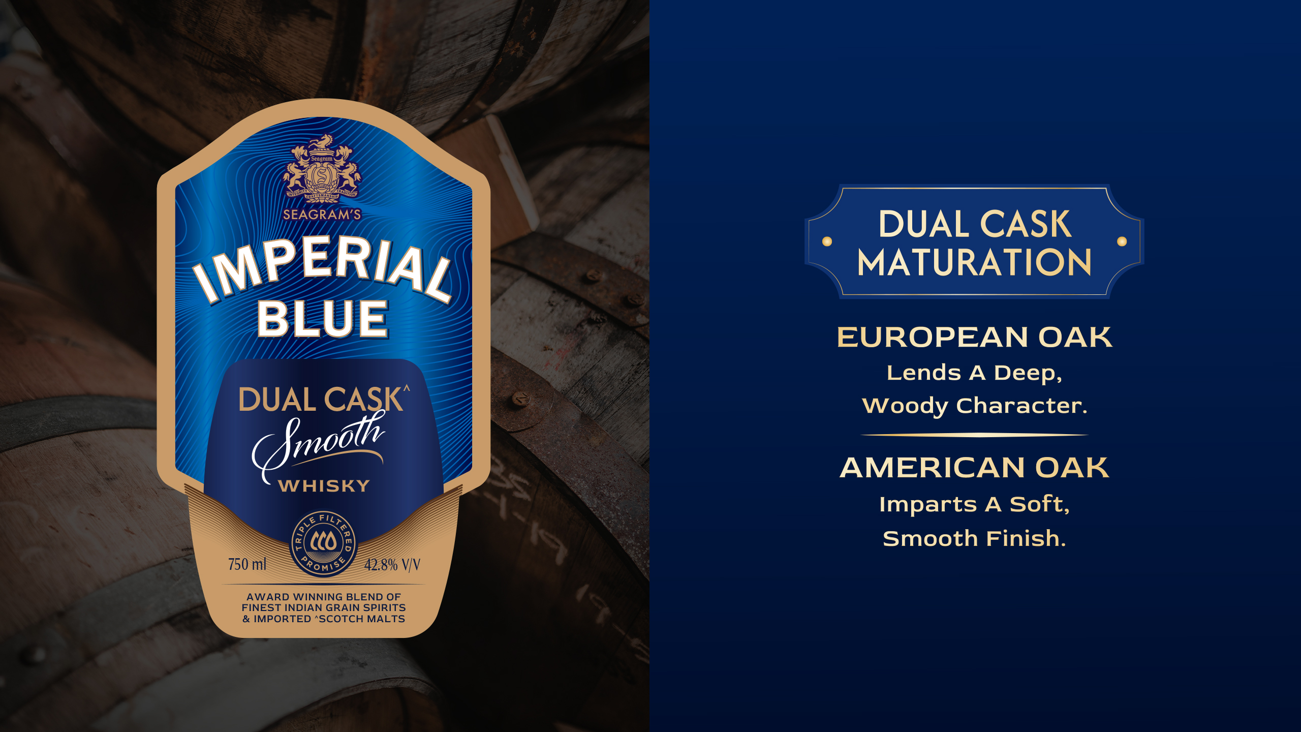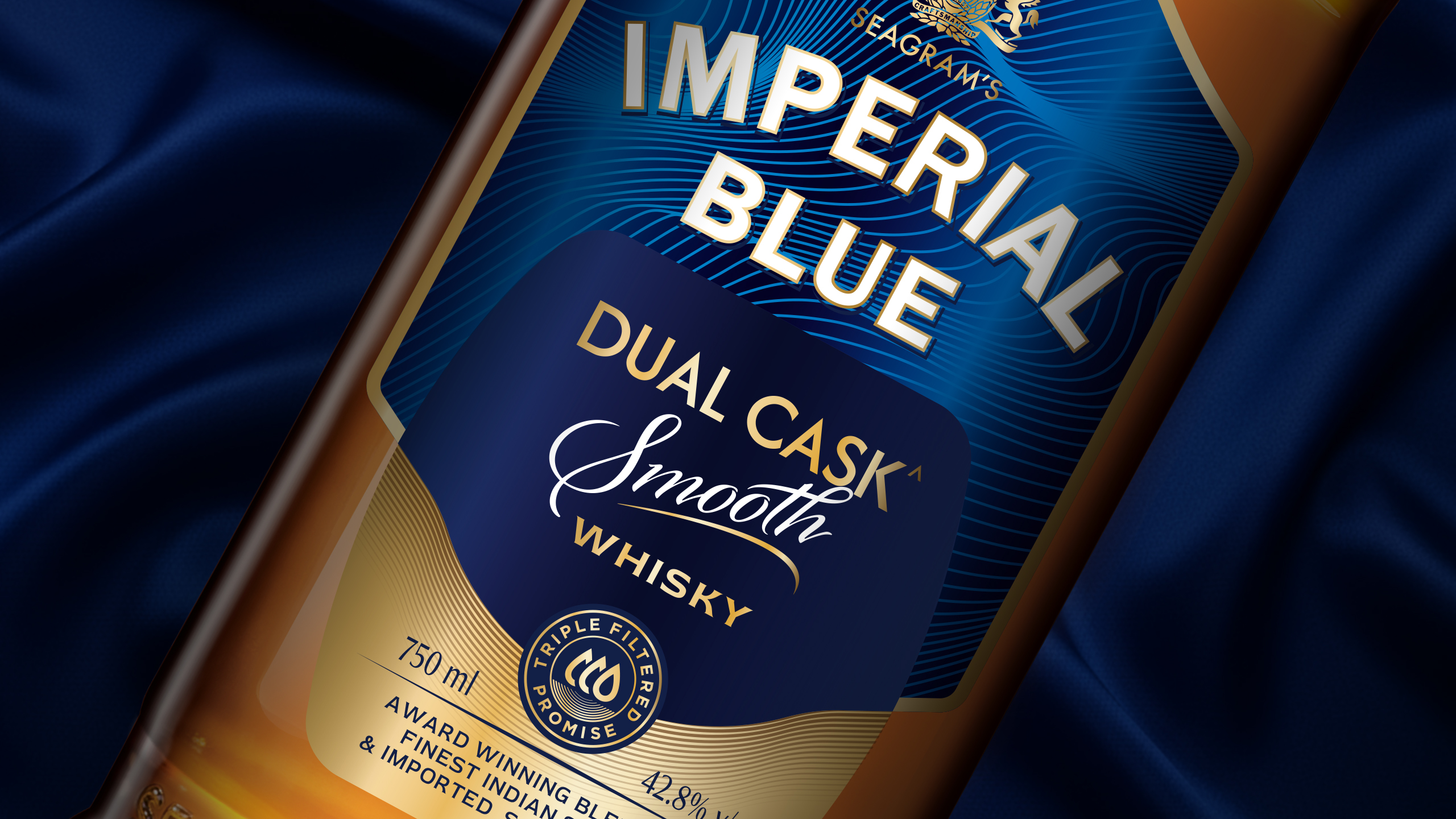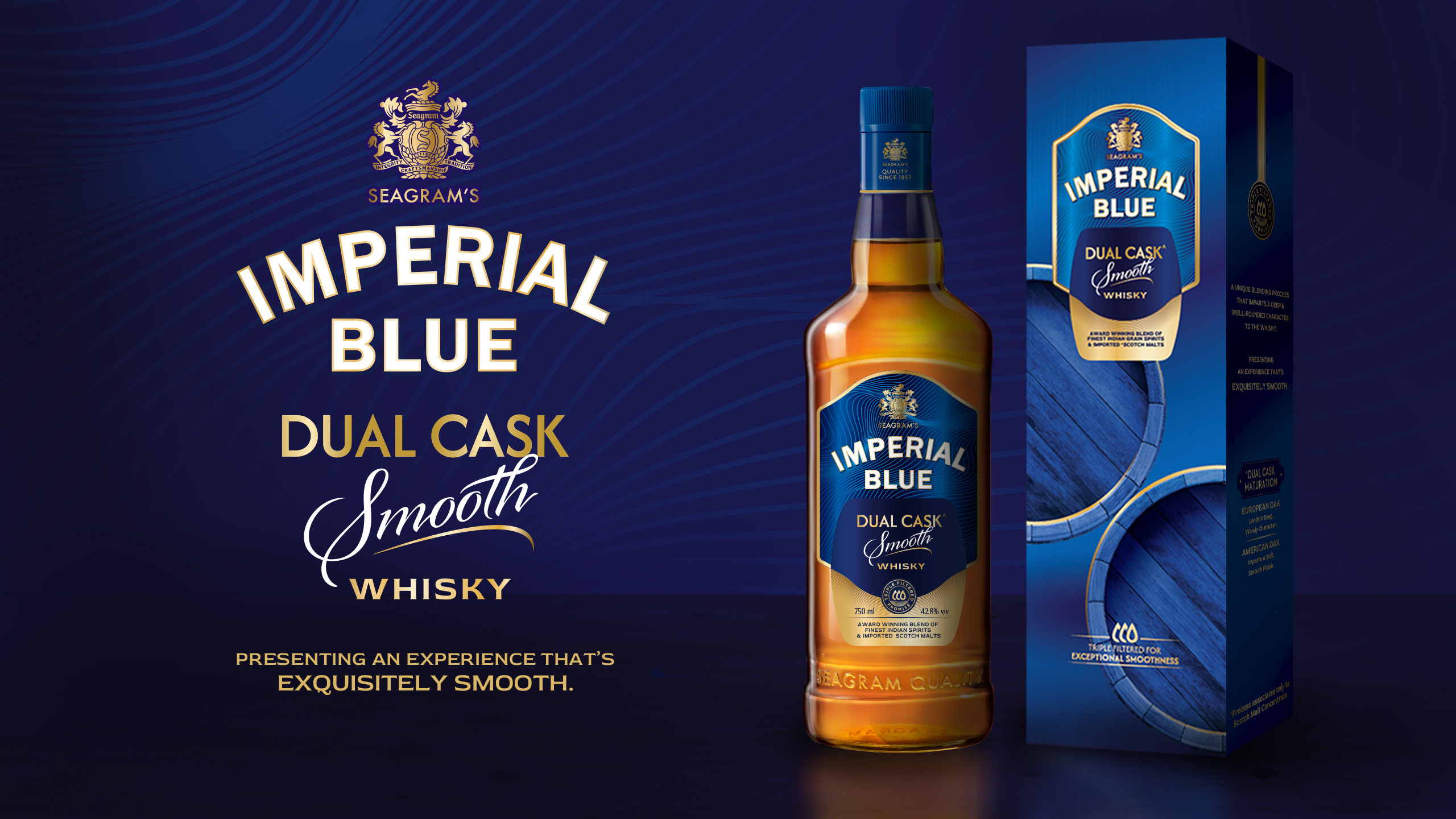
When Pernod Ricard sought to launch a superior whisky variant in the UP market, the challenge was two-fold. We needed to demonstrate superiority both through a product story as well as pack graphics. At the same time, this needed to be done while staying within the Imperial Blue brand look.
From a name that conveyed product superiority to crafting a blend story and playing it up on the label as well as the mono-carton, our design felt one level up in all respects - leaving consumers with that satisfied feeling of getting that extra bang for their buck!
PRPL
VARIANT NAME, PACKAGING DESIGN