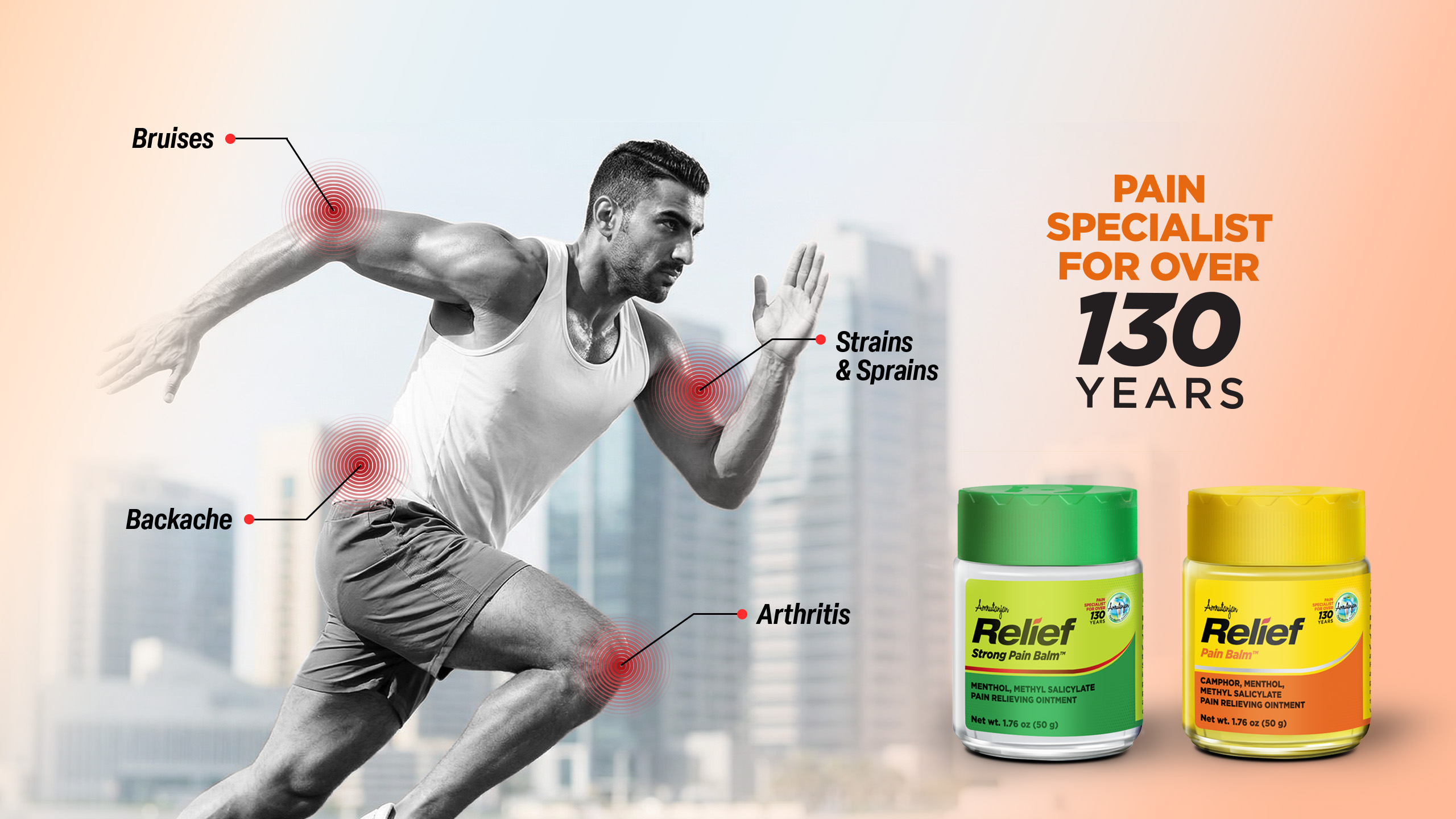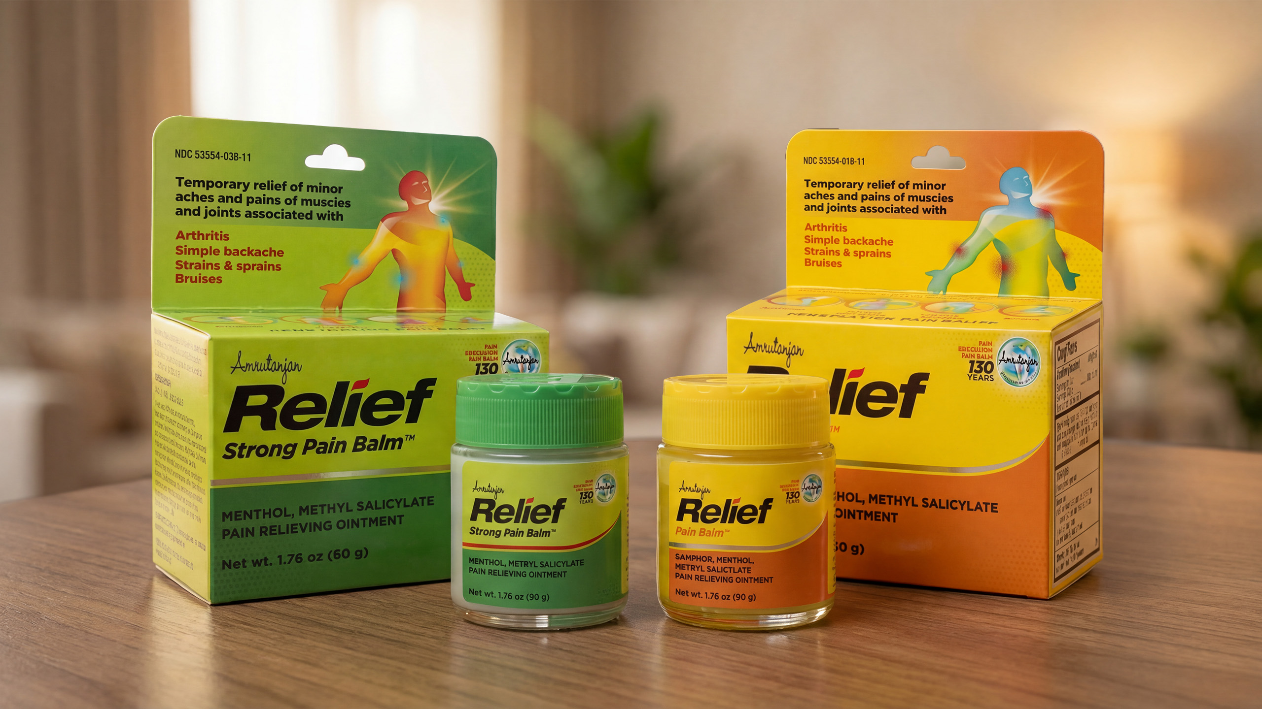



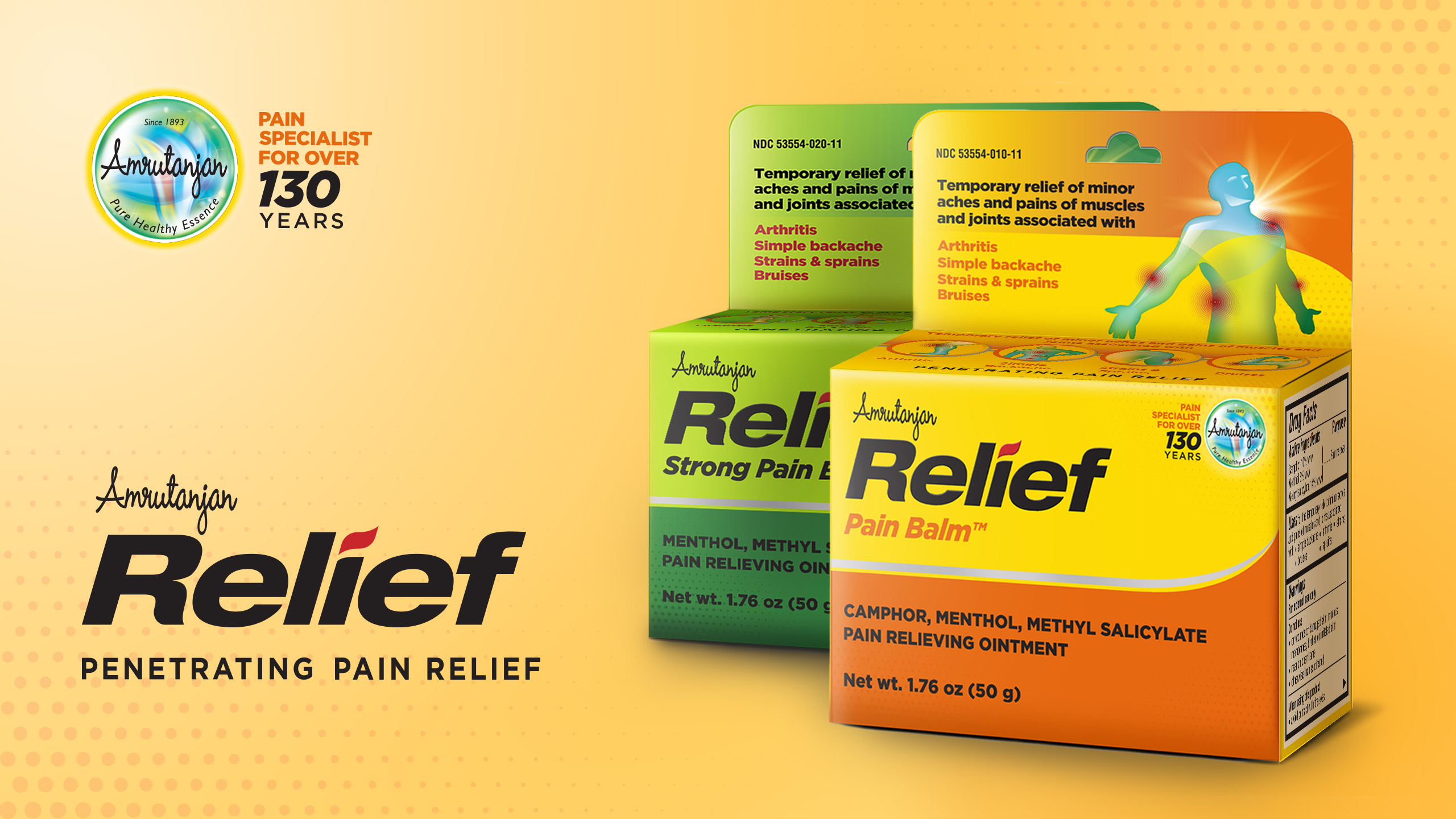

Despite its status as an iconic Indian pain-relief balm, Amrutanjan’s foray into the US market was filled with challenges. The brand realised the need for a visual language that spoke of efficacy if it wanted to appeal to a wider audience - something borne out by our analysis of OTC pain-relief drugs in the US.
Our design language - from the choice of typeface for ‘Relief’, to the colours used and bold iconography, reinforced the idea of efficacy - that here was a balm that would ‘do the job’!
Amrutanjan Ltd.
Sub-brand Identity, Architecture and Packaging Design